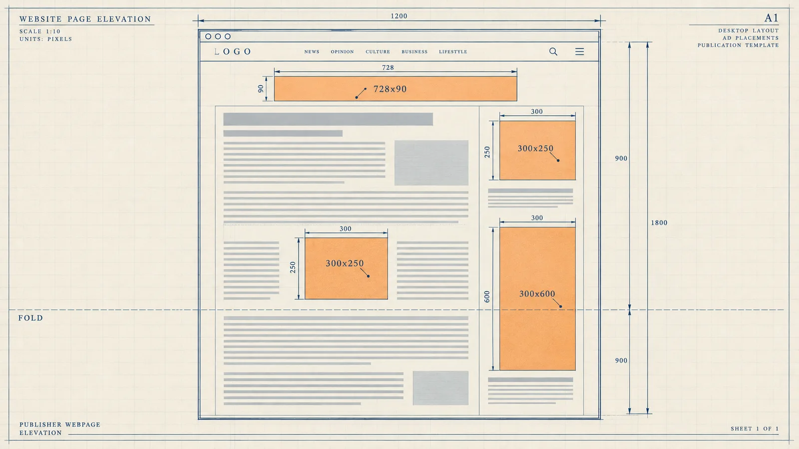
Two publishers with identical traffic, geography, and content quality routinely land at RPMs that differ by a factor of two or three. The difference sits in the template: which slots exist, where they sit, how much space they reserve, and how demand competes inside each one. This article tears down a high-performing ad layout slot by slot, so you can compare each position against your own templates and fix the ones that underperform.
Layout beats traffic because layout controls the auction inputs
An ad slot earns money through three inputs: viewability, fill quality, and the number of bidders that see the impression. Traffic volume sets how often the auction runs, but layout decides what each auction is worth. A slot placed below a 3,000-word block with no scroll trigger fires an impression almost nobody sees, and demand partners price that impression accordingly, because most buying today works on viewable CPM rather than served CPM.
The layout also controls a second, less obvious input: session depth. An aggressive template with eight units above the fold pushes readers away, which cuts pages per session and shrinks the total number of auctions the site runs per visit. A restrained layout with well-placed units keeps readers moving through pages, so each visit produces more impressions over its lifetime. We see this trade-off constantly when publishers onboard with our monetization services: the sites that earn the most per visitor are rarely the sites with the most slots.
A third input is demand composition per slot. Different sizes attract different demand pools. A 300x250 medium rectangle draws a much deeper field of bidders than a 468x60 banner, because most agency and brand budgets build creatives for IAB standard sizes. When we run Prebid across a template, the per-slot bid density varies enormously by size and position, and the layout determines which sizes get the prime real estate.
The scroll pattern that decides slot value
Readers scan web pages in a predictable pattern: they land, glance across the top, then move down the left edge of the content while skipping around. The first viewport receives near-total attention. Attention then decays as the reader scrolls, but it does not decay to zero, it stabilizes into a rhythm where the reader pauses at natural breaks: subheadings, images, paragraph ends, and the end of the article. High-performing layouts put slots at those pause points rather than at fixed pixel intervals.
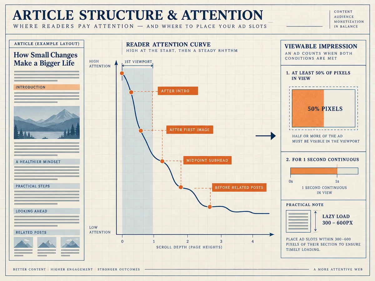
Viewability data confirms the pattern. The IAB and MRC define a viewable display impression as one where at least 50 percent of the ad's pixels sit in the viewport for at least one continuous second. Slots in the first viewport hit that threshold almost automatically. Slots placed just below a subheading or an image hit it at high rates because the reader's scroll slows at those points. Slots dropped in the middle of dense text paragraphs, or immediately after a wall of text, miss the threshold often, and the bidder data reflects it.
The practical rule from this pattern: anchor your slots to content structure, not to layout math. Place a unit after the introduction, after the first image, at the midpoint subheading, and before the comments or related-posts section. On a 1,200-word article that yields four strong positions. On a 300-word snippet page it yields two. Let the content set the slot count, and let lazy loading handle the firing order so deep slots only request ads when a reader actually approaches them.
The first viewport: leaderboard placement done correctly
The first viewport carries the highest attention and the highest brand budgets, so it deserves the most engineering care. The standard workhorse here is the 728x90 leaderboard on desktop and the 320x50 or 320x100 mobile banner, with the 970x90 super leaderboard and the 970x250 billboard as high-impact upgrades on wide screens. Our leaderboard banners page lists the exact sizes and the demand depth behind each one.
Position matters as much as size. The strongest first-viewport configuration places the leaderboard flush against the top of the content column, below the site header and above the article title, or directly under the title and byline. Placing it inside the sticky site header feels premium but often triggers policy problems and layout shift, so we advise against it. Placing it above the site logo wastes the impression on readers who scroll past the header without registering it as content.
Two details separate a good leaderboard slot from a wasted one. First, reserve the height in CSS: a 728x90 slot should hold 90 pixels of space before any ad arrives, so the page never shifts when the creative renders. Second, use responsive size mapping so desktop screens request 970x90 while tablets request 728x90 and phones request 320x50, rather than serving a shrunken desktop creative to a mobile reader. Size mapping alone routinely moves first-viewport CPMs up by a meaningful margin because it lets each device class receive the creative built for it.
In-content units: the workhorse positions
The middle of the page earns the most total impressions on long content, because not every reader reaches the end but most readers pass the middle. The 300x250 medium rectangle dominates this zone. It carries the deepest demand pool of any display size, it fits both desktop sidebars and mobile content flows, and agencies build for it by default. Our medium rectangles spec covers the variants, including the 336x280 large rectangle that performs well on desktop content columns.
Insert the first in-content unit after roughly the second or third paragraph, once the reader has committed to the article. A reader who has scrolled past two paragraphs has signaled genuine interest, and that attention is exactly what bidders pay for. Then space subsequent units at natural breaks every three to five paragraphs on desktop, and every four to six short paragraphs on mobile, where paragraph height runs shorter. Never place an in-content unit immediately after the article title or before the first paragraph, because that position reads as a wall between the headline and the content, and it sits close to policy lines around encouraging accidental clicks.
The 300x600 half-page deserves a dedicated mention. On desktop layouts with a content column plus sidebar, a sticky 300x600 in the sidebar stays in the viewport for long stretches, which produces some of the highest viewability rates on the entire page. On mobile it has no equivalent, so the mobile pattern substitutes an in-feed 300x250 or a native-style unit at the midpoint. A layout that treats desktop and mobile as the same template with different pixel widths leaves significant money behind, because the two reading patterns are genuinely different.
Sticky and anchor formats for extended viewability
Sticky formats solve a structural problem: standard in-content slots scroll out of view within seconds, while the reader keeps scrolling for minutes. A sticky unit pins one ad to the viewport edge and holds it there, accumulating viewable time instead of losing it. Google popularized this with the mobile anchor ad, a 320x50 unit docked to the bottom of the screen, and the same principle works on desktop with a sidebar unit that follows the reader once the natural sidebar scrolls away.
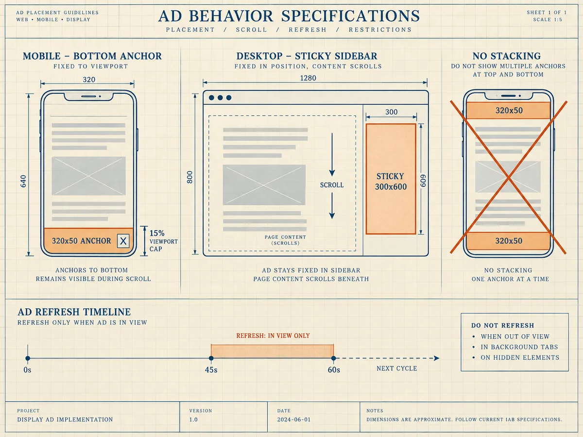
Anchor and sticky formats carry three rules. First, respect the close button: the ad must include a visible control that dismisses it, and the layout must honor that dismissal for the session. Second, cap the footprint: a bottom anchor should never consume more than roughly 15 percent of the viewport height, and Google's placement guidance treats anything that substantially obstructs content as a violation risk. Third, never stack sticky units from multiple sources at both the top and bottom of the screen simultaneously, because the combined obstruction reads as a policy issue and drives readers to the back button.
Refresh behavior defines the economics of sticky slots. A pinned unit that refreshes every 45 to 60 seconds, only while in view, multiplies the auctions the position generates per reader without adding any new screen space. We support in-view refresh inside our stack, and it works best on sticky and anchor positions precisely because their viewability stays high throughout the refresh cycle. A refresh on a slot that has scrolled off-screen wastes impressions and drags down the account's measured viewability, which in turn lowers the bids demand partners submit.
Viewability engineering: lazy loading and refresh discipline
Viewability is the single metric that connects layout decisions to CPM. Demand partners bid on the probability that a human sees the creative, so a template that fires all six impressions at page load, when four of them sit below the fold, reports terrible viewability and gets priced as low-quality supply. The fix is lazy loading: request the ad only when the slot approaches the viewport, typically when it sits within 300 to 600 pixels of the visible area.
Lazy loading changes the economics of deep slots. Without it, the sixth slot on a page monetizes the 20 percent of readers who reach it, but the other 80 percent of impressions fire unseen and poison the site's viewability average. With it, the slot fires only for readers who actually arrive, every impression has a real chance of being seen, and the site's measured viewability climbs. Higher measured viewability feeds back into bidding: buyers pay more for supply they can trust to be seen.
Refresh follows the same discipline. A refresh should only trigger when the slot is currently in view, and intervals below 30 seconds read as impression inflation to most buyers. We generally see the best results in the 45 to 90 second range for sticky positions, and we do not recommend refreshing in-content units at all, because a reader who has scrolled past a paragraph rarely scrolls back to re-see an ad. Refresh belongs on positions with sustained viewability, not on positions with a single pass.
Layout shift and Core Web Vitals
Every ad slot is a potential layout shift, because the creative arrives asynchronously after the page renders. When a slot has no reserved space, the creative pushes content down when it loads, the reader loses their place, and Google measures the disruption. Cumulative Layout Shift, or CLS, is a Core Web Vital, and Google considers a CLS of 0.1 or less a good score; what the CLS metric measures is the largest burst of unexpected shift scores across a page's lifetime. Ad-heavy templates that skip space reservation routinely blow past that threshold.
The fix is mechanical, and how to reduce layout shift from ads starts with one principle: reserve fixed space for every ad slot so late-arriving creatives never push content down. Set a min-height on each slot container that matches the slot's tallest expected creative, and hold that space whether or not the ad fills. On responsive slots, reserve the height for the size the current breakpoint will request, and update the reservation at the same breakpoint the size mapping uses. A 300x250 container should hold 250 pixels, a 728x90 container should hold 90, and a 320x50 mobile anchor should hold 50.
Two shift sources go beyond slot height. Lazy-loaded units should animate into reserved space rather than pushing content as they enter the viewport, so the reservation must exist before the lazy trigger fires. And avoid slot size negotiation that swaps a served creative for a taller one after render, such as a 300x250 slot expanding into a 300x600 without a container that already holds 600 pixels. We treat CLS control as a layout requirement, not an optimization, because the penalty hits everything at once: user experience, search ranking, and the viewability that drives bids.
Density, spacing, and the accidental click line
Density is where layouts earn or destroy trust. A template can technically fit a dozen units on a long article, and the short-term impression count looks attractive, but the outcomes compound negatively: viewability per slot drops, readers bounce, pages per session fall, and policy risk rises. Our working guidance for a standard article template is three to five display units on desktop and three to four on mobile, plus at most one sticky or anchor position. Long-form content beyond 2,000 words can support one or two more in-content units anchored to section breaks.
Spacing and separation protect the account. Ads need clear visual distance from interactive elements: navigation buttons, next-article links, download buttons, and especially anything a reader might tap on mobile. The Google ad placement policies state plainly that ads may not be placed to encourage accidental clicks, and the enforcement covers placement adjacent to buttons, ads under the same tap target as content links, and formats that mimic interface elements. A slot that sits directly beneath a "read more" link or inside a carousel's swipe zone invites both accidental clicks and a policy review.
The density decision also interacts with demand. When we funnel Prebid, Google AdX through MCM, and direct agency deals into the same template, we observe that beyond roughly six display units per page, the incremental units fill with progressively lower-paying demand, because premium buyers target the first two or three positions by viewability and context. The marginal unit often earns a fraction of the median unit while still costing the reader patience. Cutting the weakest slot and letting the remaining slots compete for the full demand stack frequently raises total page revenue, which is the counterintuitive result most publishers miss.
Mapping WireAds demand to the slots
Slot placement sets the ceiling; demand competition determines how close the slot gets to it. Our stack combines Prebid.js and Prebid Server header bidding, OpenRTB connections to exchanges and DSPs, Google MCM with AdX demand, and direct deals from global and local brand agencies, all bidding against the same impressions inside our SSP. Because premium brand budgets concentrate on IAB standard sizes in high-viewability positions, the layout should give those sizes and positions the best real estate.
The mapping is straightforward once you internalize the demand pools:
- First viewport: leaderboard sizes, 728x90 through 970x250, where brand-awareness budgets concentrate.
- Content column: 300x250 and 336x280 rectangles at paragraph breaks, the deepest and most competitive demand pool.
- Desktop sidebar: sticky 300x600 half-page, which brand budgets pay a premium for because of its sustained viewability.
- Mobile: in-content rectangles plus one bottom anchor, sized to the 320-pixel width.
- End of article: one rectangle or native-style unit before the related-posts block, where readers pause and recirculate.
Our ad formats library documents each size, its demand depth, and its recommended placement, and our team reviews templates during onboarding. We work on a CPM basis and pay Net 30, we filter unwanted ads from our premium demand sources, and we operate globally across web, app, and CTV/OTT, so the same slot logic extends beyond the website template when a publisher's footprint grows.
A teardown checklist you can run this week
Run this against your own template, one slot at a time, and record what you find:
- Count the slots per template and per 1,000 words of content. Flag any template with more than six display units on desktop or five on mobile.
- Measure per-slot viewability in your reporting. Any slot below roughly 50 percent viewability needs repositioning, lazy loading, or removal.
- Verify space reservation in the CSS for every slot, then run a Core Web Vitals test and confirm CLS sits at 0.1 or below.
- Check every ad's distance from buttons, links, and swipe zones, and move anything that sits within a thumb's reach of a tap target on mobile.
- Confirm responsive size mapping so each device class requests the creative built for it.
- Confirm lazy loading on all below-the-fold slots, with a trigger distance of 300 to 600 pixels.
- Restrict refresh to sticky and anchor positions, with intervals of 45 seconds or more, and only while in view.
- Compare revenue per slot. Remove the weakest performer and watch whether the remaining slots absorb its demand at higher CPMs.
The pattern that emerges from every teardown we run is consistent: high-performing layouts do not maximize impressions, they maximize the value of each auction. Fewer slots, better anchored, with reserved space, correct sizes, and a full competitive demand stack behind them, outperform dense templates on revenue per session and on reader retention at the same time. Tear your layout down against that standard, fix the slots that fail it, and the RPM follows.